Audi Dealer Search

Audi’s Dealer Search feature is a key tool that allows users to locate Audi partners for vehicle purchases and services, aligning with Audi’s objectives to increase customer engagement and drive sales. However, the existing system was outdated and presented several usability limitations, prompting a redesign to enhance the overall user experience.
Improve Audi’s dealer search functionality by analyzing competitor practices and aligning user experience with Audi’s business objectives ofincreasing vehicle sales and enhancing user engagement
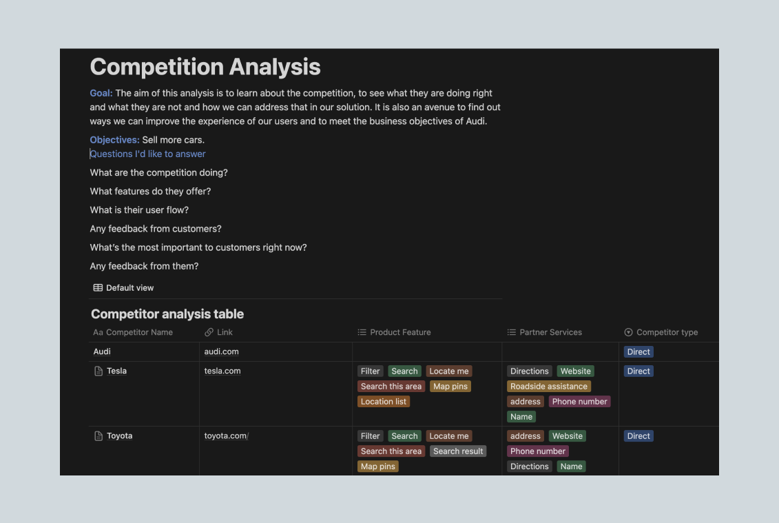
Given the absence of direct user data, I chose competitive analysis as a strategic approach to inform the redesign.
The competitive analysis was designed to achieve three main goals:
Identify Best Practices:
Understand how competitors approached similar map-based dealer search experiences, focusing on features like search efficiency, filter options, and user interactions.
Evaluate User Flow Efficiency:
Determine the optimal pathways for users to accomplish their goals and evaluate areas where Audi could streamline the experience.
Set Baselines for UX Enhancements:
Establish a baseline to assess Audi's dealer search functionality and create actionable insights for future tracking and improvements.
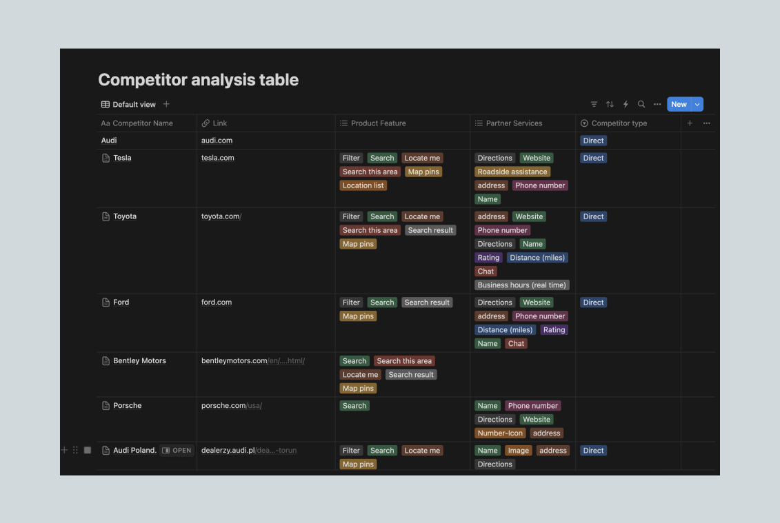
After pinpointing key usability issues through my audit, I reviewed both direct competitors including Tesla, Porsche, Toyota, Ford, airbnb and booking.com and mapped each user flow for the critical features that needed improvement.
This process involved defining expected versus actual behaviors and examining critical interactions, such as navigation, zoom functionality, filter accessibility, and the visibility of essential details like dealer location and services(Audi Case Study)


Flow Mapping and Expected vs. Actual Behavior:
I mapped each competitor's user journey, identifying the expected behaviors at each interaction point (e.g., applying filters, zooming on maps, accessing dealer details). I also analyzed the efficiency of the flows i.e time taken to complete essential tasks, such as finding a dealer and applying relevant filters. This allowed me to compare the expected user behavior with the actual experience offered. This gap analysis highlighted areas where Audi could streamline its functionality.
Features Tested and UX Metrics:
I focused on several key features critical to dealer search usability:
Filter and Sorting Options: Evaluated for ease of use, relevance, and intuitive placement.
Map Navigation and Zoom Functionality: Reviewed the zoom behavior, mouse scroll functionality, and pinch-to-zoom options, particularly noting any friction points in user interactions.
Dealer Information Accessibility: Assessed how easily users could access detailed information, such as hours of operation, services available, and contact details, and whether this information was displayed consistently across platforms.
SWOT Analysis:
By structuring findings in a SWOT format, I could systematically assess strengths, weaknesses, opportunities, and threats for each feature across competitors. This approach clarified which elements Audi could adopt or avoid based on industry standards and user expectations.
Documentation and Decision Tracking:
Based on my findings, I created a decision-tracking document to log proposed improvements. This documentation served as a transparent resource for team members and stakeholders, especially for onboarding new team members, by detailing rationale and anticipated outcomes of UX changes. This document included:
Identified issues in the current design.
Suggested feature updates to align with UX best practices.
Potential tracking metrics for post-launch analysis to measure the success of implemented changes
Through this analysis, I identified several specific areas for enhancement that could improve Audi's user experience. Key recommendations included:
Removing Full-Screen Mode:
Full-screen mode was initially available for users to navigate the map without distractions. However, users frequently had to exit full-screen to apply filters or view dealer details. Removing this feature minimized unnecessary back-and-forth actions, allowing users to accomplish tasks without interrupting their flow.


Optimizing Zoom Behavior:
Benchmarked against competitors like Tesla and Ford, I observed that intuitive zoom functionality significantly impacted usability. Implementing a more seamless zoom experience on the Audi map allowed users to focus on relevant areas without frustration.
Filter Accessibility and Prioritization of Map Pins:
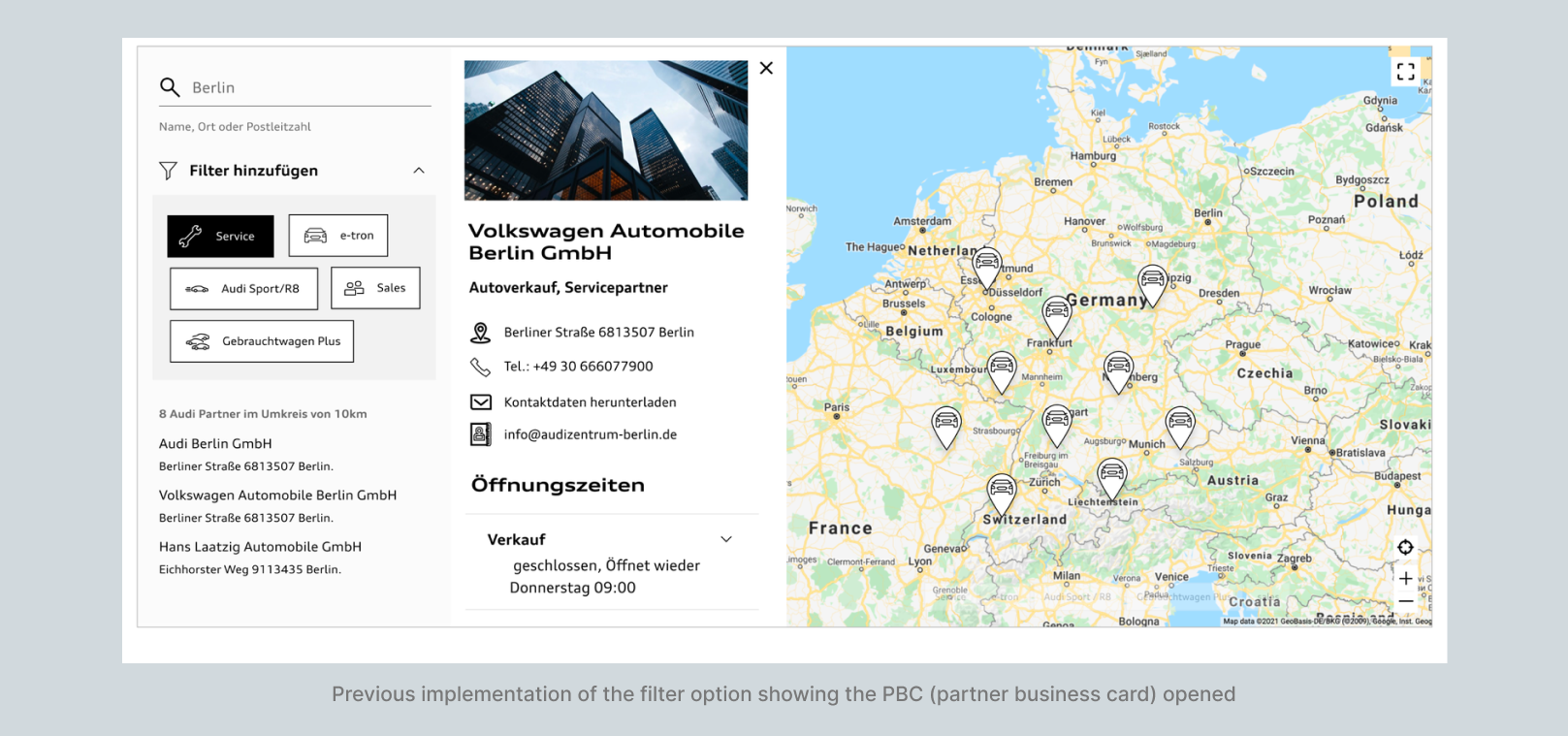
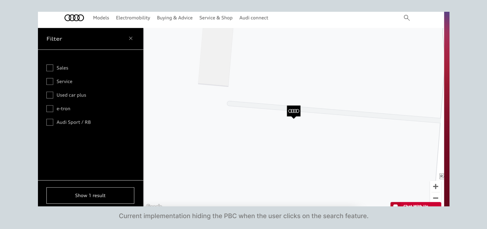
By hiding filters when the Partner Business Card (PBC) was open, users were less likely to engage in exploratory actions that deviated from their primary goal. Additionally, Since there can only be one Pin Icon and multiple filter options, I implemented a priority system where by default, the Audi logo is shown and if multiple filters are applied, the most access service icon is what would be shown this improved usability by highlighting frequently sought options.


Informed UX Improvements: The insights from the competitive analysis directly shaped the UX updates to Audi's dealer search, making interactions more streamlined and efficient. These updates are now live, giving users a smoother experience in finding dealers on the platform.
Alignment with User Needs: By closely aligning Audi’s map interactions with user expectations, we created a more intuitive experience. I suggested tracking metrics like filter engagement, task completion rates, and user feedback on navigation to measure the impact of these improvements post-launch.
Foundation for Continuous Improvement: To support ongoing enhancements, I created a decision-tracking document and proposed key metrics to guide future analysis. This structure provides Audi with a framework for evolving the dealer search experience based on user feedback and performance data.
Aligning User Expectations with Strategic Design: This project emphasized how critical it is to sync user expectations with strategic design decisions, especially in service ecosystems. Understanding what users anticipate helped us make choices that felt natural and effective in their experience.
Importance of Data-Driven Refinement: Suggesting tracking for future analysis highlighted the need for ongoing, data-backed improvements. Setting up metrics now means that Audi can keep refining the dealer search functionality as user needs evolve.