airvee
Overview:
Duration: 6 months
My Role: Lead Designer
Team: CEO, CTO, Engineers, 2 Junior Designers
Project Type: User Research, Service and Product Design
Duration: 8 weeks
Background and Context:
MetaCraft set out to solve a recurring problem for many users: the difficulty of finding skilled, reliable artisans for a range of household services, including plumbing, electrical work, and tailoring. Initially developer-led, the platform’s design lacked cohesion and ease of use, causing friction in the user experience and limiting its appeal. Recognizing this, MetaCraft sought a designer who could redefine the product vision, enhance usability, and create a brand-aligned, intuitive interface.

Objective:
Enhance MetaCraft’s platform to create a reliable, seamless experience for users needing artisans across various services. The goal was to overcome barriers in user trust, improve service accessibility, and align the platform's look and feel with the brand’s core values of reliability and convenience.
Summary of Impact:
By leading the UX and service redesign at MetaCraft, I transformed the platform’s user experience, improving usability, accessibility, and user trust. My work in journey mapping and service blueprinting clarified service expectations, reduced friction, and created a seamless connection between users and artisans. These changes not only enhanced user satisfaction but also positioned MetaCraft for scalable growth by aligning the platform closely with real user needs.
My Role:
MetaCraft needed a designer to advance the platform’s design since previous development efforts led to a product with notable usability gaps. I stepped in to lead the design and product strategy, beginning with a Heuristic Evaluation (HE) to assess the current system’s state and identify critical usability issues. With these insights, I mapped out the next steps for the redesign, focusing on improving accessibility, aligning with MetaCraft's brand goals, and crafting an intuitive, cohesive user experience.
Problem Discovery & Research
Initial Audit: Conducted a heuristic evaluation (HE) using Jakob Nielsen’s principles to uncover critical UX issues, including:
Onboarding Friction: Missing field labels led users to forget their inputs, and password requirements were not clearly indicated, increasing potential entry errors.
Service Request Confusion: Copy was often misleading (e.g., users felt they had to pay upfront before knowing their assigned artisan), and there was no search functionality for services, limiting usability.
Inconsistent UI Elements: Icons lacked uniformity, contrast was low, and visual hierarchy issues made navigation challenging.
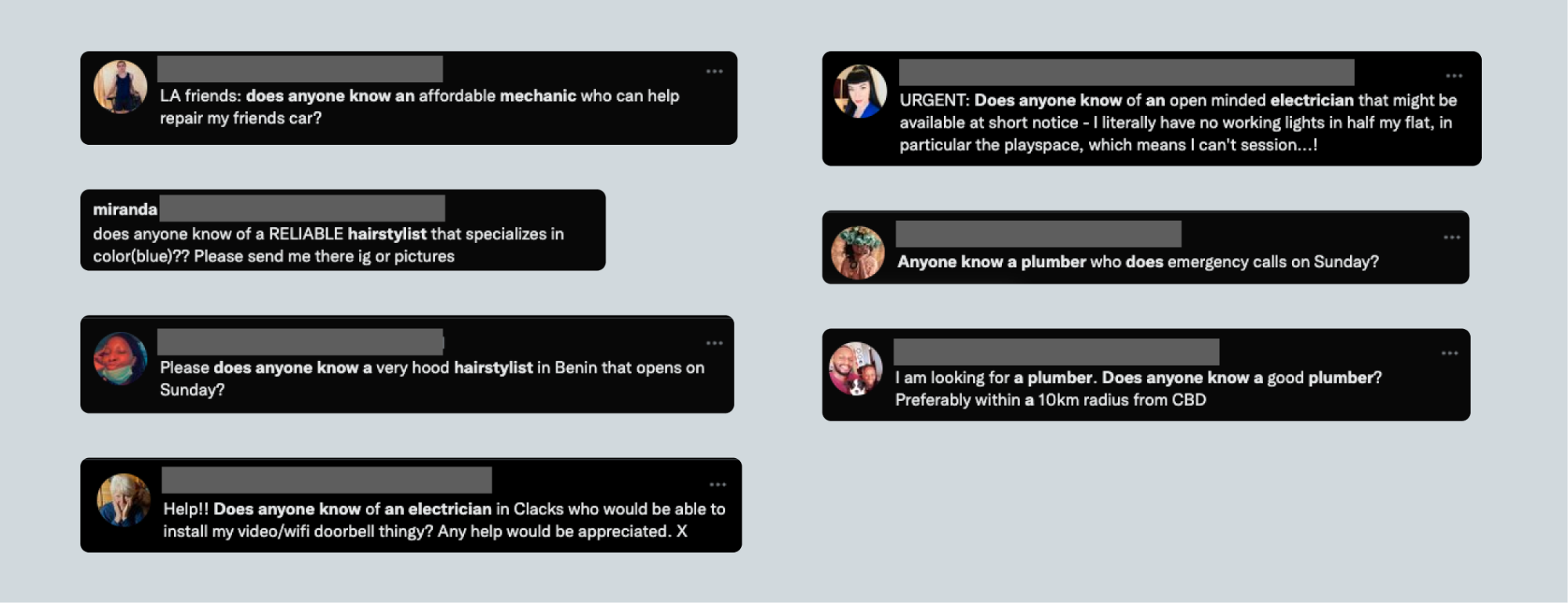
User Research:Conducted interviews with potential users to explore how they currently find artisans, challenges they face, and their expectations for trustworthy service providers.
Explored JTBD Framework: Mapped key Jobs-To-Be-Done (JTBD) across user scenarios instead of traditional personas, recognizing that user needs centered on situational requirements rather than fixed demographic profiles. For instance, users might need plumbing services in a new area, or laundry services after a busy week.
Stakeholder Insights: Collaborated with MetaCraft’s leadership to align on primary goals and target audiences (Millennials and Gen Z), whose tech-savviness informed design decisions, making the experience intuitive for those accustomed to app-based solutions.
Process
User Journey Mapping & Flow Design
Detailed User Journey Map: Mapped a comprehensive user flow diagram involving all stakeholders—users, artisans, and MetaCraft administrators. This map highlighted critical stages, from onboarding through service request, confirmation, and feedback loops, identifying user pain points and where each stakeholder’s actions impacted the others.
User Flow Diagrams: Created system-wide flow diagrams that broke down the user journey, touchpoints, and potential drop-off points. These diagrams provided insights into areas where user experience might be compromised by other roles (e.g., admin delays or artisan responsiveness), enabling targeted improvements in system design.
Iterative Review: Used the journey map to guide redesign priorities, emphasizing ease of access for frequently used functions and reducing steps for high-demand services.

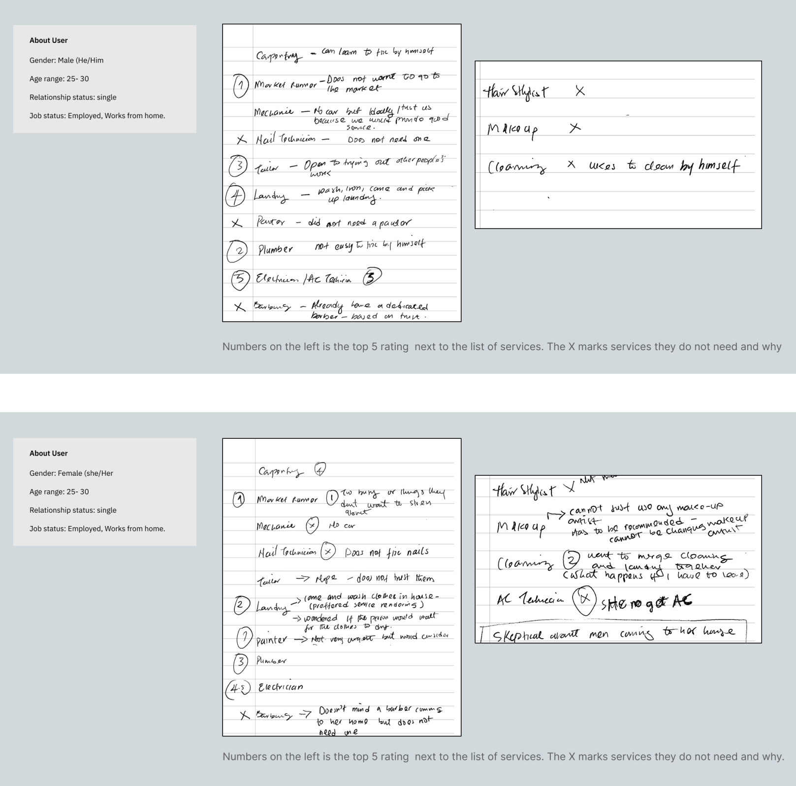
Service Prioritization for MVP: As part of the redesign, I conducted an exercise to understand which artisan services users prioritized. I asked users to rate services in order of importance, expecting this would reveal their needs and preferences. During the exercise, I discovered an unexpected insight: users had varied interpretations of the services themselves. For instance, when discussing laundry, some users expected in-home cleaning, while others assumed a pickup and delivery model. This difference in understanding highlighted the need for clearer communication around service expectations on the platform.
Learning this during the exercise allowed me to adjust the platform’s service descriptions and workflows to better align with user expectations.
I also engaged the MetaCraft team in a similar exercise, asking them to rate the services. Interestingly, our team’s approach differed; we prioritized services based on skill difficulty, assuming that users would be more likely to outsource tasks requiring specialized skills they did not possess. This difference in rationale—users prioritizing frequency and convenience while the team emphasized skill complexity—was invaluable in shaping the final service lineup. By combining these insights, we ensured that the platform’s offerings aligned more closely with real user needs, providing a clearer, more tailored experience. We also improved clarity for both users and service providers, reducing misunderstandings.

Scenario-Based Personas: To capture the essence of user needs in real-world contexts, I chose scenario-based personas over traditional ones, focusing on situational requirements rather than demographics. This allowed the team to design around actual needs, ensuring the platform’s flexibility and relevance.
As a user who has just moved to a new location when i need to fix my plumbing issue, I want to be able to easily find a reliable and professional artisanAs a user who has just bought car when I need to fix my issue with it, I want to be able to easily find a reliable and professional artisanAs a user who has is tired of getting messed up by artisans when I need the services of an artisan, I want to be able to easily find a reliable and professional artisan
. Redesign and Iterative Testing
Redesign Process: Addressed multiple layers of user experience, focusing on accessibility and intuitive interaction:
Onboarding Screen: Redefined the onboarding experience to prevent input errors, clarify password criteria, and improve field visibility, aligning with HE findings.
Service Request Flow: Enhanced the service request process by introducing a multi-request feature for a single artisan, clearer payment options, and straightforward button labels that reflected real-time response capabilities.
Home Screen Iterations: Redesigned the home screen, placing quick-access features like “Recent Requests” and “Popular Services” based on ergonomic positioning, user frequency, and familiarity. These adjustments aimed to make essential services more accessible.

Usability Testing: Conducted moderated usability tests on Figma prototypes, where users simulated tasks to explore the new flows and options. Observed that giving users flexibility in form submission (such as multiple service selection) enhanced navigation ease and alignment with user goals.
Results and Learnings
Results
Enhanced Accessibility and Usability: Redesigning user flows and fixing usability issues made the platform feel a lot more intuitive. The goal was to reduce onboarding friction and make requesting services straightforward, so users wouldn’t have to second-guess what to do next.
Increased User Satisfaction and Trust: By clarifying service descriptions and streamlining workflows, we wanted to give users a consistent experience they could count on. Clear expectations were key to building trust, so users would feel confident coming back to the platform.
Improved Efficiency in Service Matching: Optimizing the service request flow aimed to create faster, more reliable connections between users and artisans. The goal was to reduce any waiting or confusion, creating a setup where repeat use feels natural and easy.
Scalable Foundation for Growth: These design changes laid down a flexible structure that could grow with MetaCraft’s expanding user base. The workflows are scalable and align with user needs and business goals, so they’re ready to support MetaCraft as it grows.
Key Learnings
The Value of Scenario-Based Design: Using scenario-based personas to focus on real service needs helped us make the platform more relatable and useful. Thinking through actual user scenarios made it easier to design something that naturally fits into people’s lives.
Aligning Internal and External Perspectives: The differences in service priorities between the team and users reminded us how important it is to bring users into the design process. Having their feedback early helped us focus on real needs and avoid assumptions.
Continuous Improvement through Iteration: Regular testing and feedback helped us keep improving the design. Taking in user feedback along the way allowed us to make adjustments that keep the platform aligned with what users actually want and need.

